
To begin with I did some initial research into illusions and also some inspiring patterns/artworks.

Damien Hirst, 2010, Butterfly Postcard, viewed 8th April 2012,
I love the Kalediscope effect, I really like symmetrical patterns like this Ricardo Tisci Print for Givenchy (also used on the Watch the Throne cover)

Ricardo Tisci, 2011, Bird of Paradise Print, viewed 8th April 2012,
I looked up a couple of different illusions that I liked as well such as

M. C. Escher, 1953, Relativity, viewed 8th April 2012

http://en.wikipedia.org/wiki/Penrose_triangle

Lionel Penrose and Roger Penrose, 1959, Penrose Steps, viewed 8th April 2012,
_________________________________________________________________________________
From this brief research I did some sketches of illusions so and illusions patterns as a way to start brainstorming.


This last sketch was kind of a tangent from the first three, whilst sketching the first three I had the idea that I wanted to kind of marry the my direct environment which is made up of buildings (since I live right in the city) with the natural rocks, so make the rocks look as though they were emerging from the water in building like formations. This kind of formation kind of reminded me of way that stalactites and stalagmites form, or the way that crystals grow out of the rocks, so it all seemed fitting with the rock theme.
So now I was beginning to look at rocks and making my pattern more abstract lines and turning these lines in to looking like other images. In a cafe our table number had this graphic on the back of it

The geometrical lines inter connecting inspired me to try and do something like this, I was particularly interested in recreating the eye in a kind of collage effect. It kind of reminded me of the term 'the hills have eyes' and I thought the creepy watching aspect kind of fitted in with the illusive illusions that I explored before.
As well as my photos that I took at the blue mountains (which I will upload all of them in to another post) I also decided to look at some of the photos that my family took on our vacation to the grand canyon as inspiration.


_____________________________________________________________
 I then begun to start playing with the photos on photoshop. I first begun with creating a plain stripe. I did this by taking a photo and reflecting it on the vertical axis twice so that a kind of continuos landscape was created.

I then kept doing this until this was created

The photos that I used for this were:
Top stripe

The three middle stripes were all the same photo just chopped into different sections
 The bottom stripe was this photo

 I really didn't like this pattern, I thought that it was boring, lacked cohesion and the colors were ugly. I suppose I did this more as an exercise to get myself used to using photoshop and as an exploration of what I dont like.
_____________________________________________________________
I then went on to start constructing the eye. At first I tried to create an eye from memory using different elements which I found the photos
for example
 I thought that didn't work so well and wasn't the look that I was hoping to achieve. So then I decided to put the photo on the back and overlay different macro and micro photos to gradually build the eye up.
 Firstly I made the pupil. I did this by taking this photo, using the burn photo to mark int he rocks and oversaturate there colors. I then reflected and rotated it so that it made a square. From there I then cropped it into the shape of a circle. I thought it was a good photo because it is very dark like a pupil but then has some texture so it makes it more interesting and gives it more depth.


I then took it over into another document and started building up the eye. Here are the process shots
From there I then changed the colors and thought that it would be cool if I did a kind of creepy eye melting thing so I also put it through the liquify tool.
So now I was beginning to look at rocks and making my pattern more abstract lines and turning these lines in to looking like other images. In a cafe our table number had this graphic on the back of it

The geometrical lines inter connecting inspired me to try and do something like this, I was particularly interested in recreating the eye in a kind of collage effect. It kind of reminded me of the term 'the hills have eyes' and I thought the creepy watching aspect kind of fitted in with the illusive illusions that I explored before.
As well as my photos that I took at the blue mountains (which I will upload all of them in to another post) I also decided to look at some of the photos that my family took on our vacation to the grand canyon as inspiration.


_____________________________________________________________


I then kept doing this until this was created

The photos that I used for this were:
Top stripe


____________________________________________________________________
In the end the basic stripe pattern that I ended up creating looked like this 
_____________________________________________________________
I then went on to start constructing the eye. At first I tried to create an eye from memory using different elements which I found the photos
for example

 Firstly I made the pupil. I did this by taking this photo, using the burn photo to mark int he rocks and oversaturate there colors. I then reflected and rotated it so that it made a square. From there I then cropped it into the shape of a circle. I thought it was a good photo because it is very dark like a pupil but then has some texture so it makes it more interesting and gives it more depth.
I then took it over into another document and started building up the eye. Here are the process shots
 |
| Overlaying the photos, with the appropriate colors for the part of the eye |
 |
| trying to find the most appropriate part to make the darker part of the lid |
 |
| the eye made without a bottom lid or eye brow |
 |
| looking at the different photos to use for the eye brow |
 |
| the final product - all made from images from the blue mountains |
From there I then changed the colors and thought that it would be cool if I did a kind of creepy eye melting thing so I also put it through the liquify tool.


I then experimented with adding text underneath it because I thought it could look cool

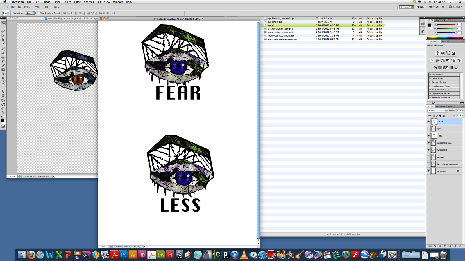
however I then decided that it would probably look to busy once i put it into repeat.
Now that I had this art work I was stuck as to what to do with it because a simple block repeat would be too boring. So I looked at overlaying it over an artwork that I had made perviously which combined water photos and the Grand Canyon
 |
| Initial art work - Grandcanyon photo in reflect with a photo of water ripples with an overlay filter |
 |
| I then started building up the eyes with an overlay filter |

Once I got to this point i realized that I didn't like this either because it forced the eye to travel from top to bottom too much which would mean when it is in repeat it wouldn't flow particularly well (in my opinion) I wanted to make something more seamless.
I then decided that it could look cool if I combined it on a stripe, so I recreated another two stipe with the eyes in the middle.

_____________________________________________________________
TRIANGLE PATTERN
What I did was have the image printed out next to me and recreated it by using stripes as showen and just rotating them into place


 |
| I then fixed up the corners. |
I then thought that it would be fun to try using the different overlays and created this effect with the colors


I then decided to go back to the stairs idea but instead us the photos that I had taken of waterfalls with slow shutter speed as the stairs. The photos I used for this were


Then I started over laying them and working them into an artwork


I kind of wanted the water to flow into one another and become this continuos stream of water so I started experimenting with changing the opacity and the liquify gallery

 |
| I didn't really intend on making this but i got carried away and really really liked this effect, i reminded me of a marble print that ksubi did back in 2009 |

Now that I had found an art work that I really liked I decided to put it into half drop repeat, I did this by following the tutorial on UTS online. Here are the process screen shots


